Our Title Design!
Hi viewers welcome back, today this blog will be introducing our ideas for our title design!
Our Font: We’re hoping to mimic the fonts of other thriller movies, that including dramatic bold colors that imply the theme for the movie. For example, The Night Lamp, Stranger Things, and Bloody Mary all have bright red fonts that are chosen to evoke fear for the movie. A lot of thriller or horror movies include blood dripping from their titles for effect as well.
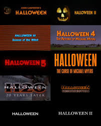
Contrast: Color: As previously stated, thriller movies commonly used bright colors such as red, that stand out from the background. The Halloween movies all have very similar title cards with bright orange font and a contrasting color background. This is important because it implies the upcoming events of the storyline. The title cards shown down below show two examples of the same movie franchise that have chosen to use both bright bold colors for dramatics, and simple black and white font which proves to be just as creepy as the bright bold colors, because those who are familiar with the movie, know how scary the movie is itself.
Working title: Currently, we aren’t set on a specific title for our movie sequence, it most likely will be something surrounding the idea of the detective, but we want the idea of him actually being the murdered a secret. So we’re aiming for something more subtle and simple such as “The Detective” that keeps the storyline a mystery for the audience.
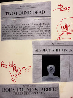
Our titles such as “Produced by…” and so on, will probably appear either faded in or out of the scenes, or will be incorporated by being shown in the back of someone’s shirt, or as a file on the detectives desk. We want it to be unique but fit the storyline as a murder mystery.
The titles will be on the screen long enough for the audience to read and notice them but short enough that they aren’t the main focus of the shot.
For example, our establishing shot is currently undetermined, but will be impactful enough to set the scene for the entire opening sequence.
We will use angles and shots such as close ups for some of the titles, (as previously stated for the titles to show up on the detectives desk, we would use a close up to make sure it’s included) Medium shots, long shots, and over the shoulder shots are all very frequently used in thriller movies, and therefore will be incorporated into our opening sequence.
There could possibly be a running shot which would then be used as an over the shoulder shot. Depending on the setting we will use high and low angled shots to show specific details within the film. Pans will be used to show details that will imply the storyline of him being the murderer, without fully giving away the plot.
Our soundtrack most likely will be music that makes the film seem innocent and normal while showing the detective, because that’s how he wants to be perceived, but as the sequence continues we will most likely start to incorporate more suspenseful music as the audience realizes something is wrong. This is our non-diegetic sound. The diegetic sound that will be used is going to be natural noises such as sticks snapping in the woods for suspense or background talking in the detectives office.


Comments
Post a Comment