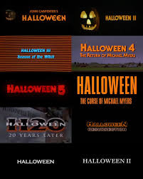
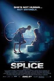
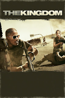
Hi viewers welcome back, today this blog will be introducing our ideas for our title design! Our Font: We’re hoping to mimic the fonts of other thriller movies, that including dramatic bold colors that imply the theme for the movie. For example, The Night Lamp, Stranger Things, and Bloody Mary all have bright red fonts that are chosen to evoke fear for the movie. A lot of thriller or horror movies include blood dripping from their titles for effect as well. Contrast: Color: As previously stated, thriller movies commonly used bright colors such as red, that stand out from the background. The Halloween movies all have very similar title cards with bright orange font and a contrasting color background. This is important because it implies the upcoming events of the storyline. The title cards shown down below show two examples of the same movie franchise that have chosen to use both bright bold colors for dramatics, and simple black and white font which proves to be just a...
