Welcome back viewers!! As you know we’ve been researching genres for our opening sequence, this blog will be about the romance genre! The setting cam be used to create a romantic atmosphere such as a candlelight dinner, a science beach view, or a city skyline. The setting can also be used to reflect the characters emotions and personalities. Costumes can be used to convey the characters personalities social status and style. In a romance movie, costumes can be used to create a sense of intimacy and connection between the characters. Movies such as these may use a tuxedo and a nice dress for a night out or a casuals look for an evening dinner. Lightning can be used to tell the mood of the story such as a candlelight soft lighting or the warm glow of a sunset or sunrise. Lighting can be used to tell the actors emotions. A bright light may indicate happiness, or a dark light may indicate sadness or introspection. Romance movies typically use a brighter light when ...
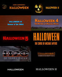
Hi viewers welcome back, today this blog will be introducing our ideas for our title design! Our Font: We’re hoping to mimic the fonts of other thriller movies, that including dramatic bold colors that imply the theme for the movie. For example, The Night Lamp, Stranger Things, and Bloody Mary all have bright red fonts that are chosen to evoke fear for the movie. A lot of thriller or horror movies include blood dripping from their titles for effect as well. Contrast: Color: As previously stated, thriller movies commonly used bright colors such as red, that stand out from the background. The Halloween movies all have very similar title cards with bright orange font and a contrasting color background. This is important because it implies the upcoming events of the storyline. The title cards shown down below show two examples of the same movie franchise that have chosen to use both bright bold colors for dramatics, and simple black and white font which proves to be just a...
Hi viewers! I’m back, and this time with a new project for you all! I’m really happy to inform you guys that my group, original to the music video, are going to be making the first opening sequence of a movie. We are really excited to be able to make this as creative as possible, it’s a big responsibility to make this is unique and exciting as possible. We aren’t sure what our genre is quite yet but i’m sure we will come up with something that is entertaining and provides all of the information needed. We are also going to be including a soundtrack that consists of one song that we will also have to align with the genre and ambience of the film. We aren’t going an entire short film, which means we have to make this as precise as possible with all of the components. The short portion of the film should be able to reflect the entire storyline with little to no dialogue and as much action to direct the theme as possible. We are going to be editing a little more for this one, because ...
Comments
Post a Comment